Brand Style Guide — v1.0

A 2D space mining game about fuel management, asteroid salvage, and upgrading your ship for longer runs into the unknown.
A 2D space mining game about fuel management, asteroid salvage, and upgrading your ship for longer runs into the unknown.
Rooted in a retro-70s warmth with deep space contrast. The stripe gradient is the brand's most recognizable visual motif. Click any swatch to copy its hex code.
The signature stripe gradient — always in this order: Amber → Orange → Burnt Orange → Maroon. Used on the logo, ship livery, and UI accents.
A clean geometric sans-serif with warmth. Versatile across display and body text. Used at heavy weights for titles and light weights for body copy.
The wordmark features the signature stripe motif integrated into the letterforms. A mono (solid black) variant and a shortcut icon are available for contexts requiring simplified marks. All versions should maintain adequate clear space and never be recolored outside approved treatments.


The main capsule image used for the store listing. This is the primary hero art players see when browsing — it should always be presented uncropped and without overlaid text.
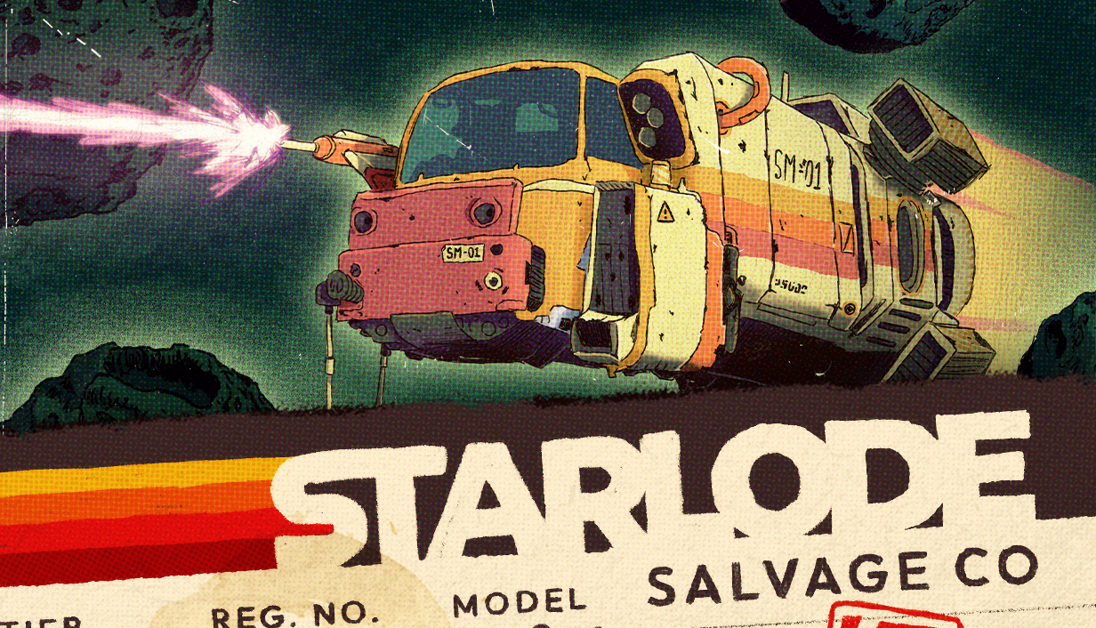
Starlode Salvage Co has the feel of a well-worn work vessel — functional, gritty, but with character. The brand should feel like a retro space trucking company that's been around the belt a few times.
This isn't a warship — it's a salvage rig. Language should feel practical, worn-in, and a little rough around the edges. Think space trucker, not space admiral.
Lean into 70s industrial aesthetics: dials over digital, chunky over sleek, analog grain over clean vector. The visual language should feel like a faded NASA manual.
The core tension is fuel vs. greed. Marketing and UI copy should play on this: "How far will you push it?" The further you go, the bigger the haul — but also the bigger the risk.
Despite the danger, there's comfort in the loop. Coming back to upgrade, planning the next run, watching your ship improve. It's satisfying, not stressful.
Keep the brand consistent — these ground rules apply across store pages, social media, UI, and marketing materials.
CSS variables ready to drop into any project. Click the block to copy.
/* Primary — The Stripe */
--amber:        #E8A628;
--orange:       #D4752E;
--burnt-orange: #B84422;
--maroon:       #8B1A1A;

/* Neutrals */
--cream:        #E8D5B5;
--tan:          #C4A87A;
--dark-brown:   #2A1F17;
--deep-space:   #0F0E0C;

/* Accents */
--teal:         #2D5A50;
--space-green:  #1A3A35;
--laser-pink:   #D94FA0;
--ship-salmon:  #C97070;